

When it comes to today’s fast-paced business world, having the proper business intelligence software is a must.
Indeed, studies show that companies who are able to accurately make data-driven decisions are 77% more likely to succeed than those who don’t. In a competitive market, this difference is a matter of sink or swim—as those who can turn complex data into actionable insights will have a decisive advantage over those who don’t. This is likely why business intelligence software is one of the fastest-growing industries on the planet—with an estimated 8.3% compound growth rate over the next 5 years.
Within the industry, Microsoft’s Power BI is by far the most popular business intelligence platform, with software review site Trust Radius estimating Power BI accounts for a 36% market share. However just because it’s most popular in use, doesn’t mean that Power BI is necessarily the best tool for every company or department. Company and team size, data type, integration needs, and data visualization needs all influence what kind of business intelligence software is best suited for the job, and these differ situation by situation.
Furthermore, even if your company already has Power BI, it doesn’t mean there isn’t a need for a separate specific business intelligence program that can augment your data pipeline. It’s shown that companies on average use between 3 and 4 different types of business intelligence software.
So to help businesses navigate their search for business intelligence software, we put together a list of the 5 best alternatives to Power BI in 2023, and what to expect in each.
Before we get into our list of specific software, it’s important for anyone evaluating business intelligence software to analyze what their data output needs are. This will help to differentiate between software that tends to have the same description and tend to offer similar benefits.
Here’s a couple factors we encourage prospective users to consider:
Platform. When it comes to BI software, there are three main platform types: desktop, web-based, and mobile app. Many modern enterprise software companies offer all three, however some don’t. It’s important to evaluate which is most important for your needs.
Interactive or static. In the last 5 years there have been great strides in interactive dashboards. These are ones that allow you to segment or filter charts and graphs in real-time, rather than present findings as a fixed image. Determining if you need your BI software to present quarterly KPIs could be very different than actively sorting on a daily basis to find trends.
Ease of Use. Some software requires an onboarding time of 1-3 months, and coding languages such as SQL to be used properly. It’s important to consider how much time you can dedicate to onboarding employees, and how technical they are.
Integration. For most users, their business intelligence software is not a standalone tool, but one that fits into a larger pipeline. Understanding how BI software integrates with your data warehouse or broader ETL process will help avoid headaches down the road as every project involves fetching data first.
Price. Most data software is priced monthly per user. Your company size and budget may affect what software you choose.
While these specific questions and factors help to determine what software to choose, the overarching golden rule when it comes to choosing the right BI platform is what software will most quickly and easily give me the actionable insights I need to make informed business decisions. This may be a simple platform, or it may be a hyper visual one. You will know better than any salesperson.
With that framework in mind, let’s proceed to our list of best Microsoft Power BI Alternatives.
Price: Starts $70 per user/month
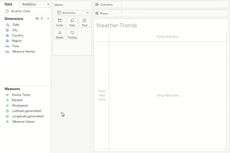
Tableau is the second most popular business intelligence software worldwide, and is known in large part for its b data visualization and data connection capabilities. Tableau touts itself as being able to connect directly with hundreds of different data sources with just a couple clicks, both on-premise and in the cloud. This includes integration with a broad range of APIs, SQL databases including Oracle and Salesforce. It can also work with data directly from other cloud apps like Google Analytics.
Tableau also has a drag-and-drop interactive dashboard builder that lets you present datasets how you want. It has visualizations including maps and charts that are complex and in-depth, making it popular for data visualizations beyond standard charts and graphs.
One of the negatives of Tableau is that while good for complex graphs, many users complain of an overly complicated UI for simple data manipulation. Some users have described exporting their data to Excel to manipulate and then back to Tableau when they want to visualize. There is also a definite learning curve to using the software, particularly the visual elements, for which dedicated courses last anywhere from 6 weeks to 3 months (these can also cost hundreds of dollars per user).
There’s a definite split on how useful the real-time dashboards are in Tableau, with some people saying they are extremely satisfied and more advanced users complaining a lack of customization, slow report refresh rates and Tableau slowing down when showing complex visual elements or large datasets.
Lastly, of all the software we investigated, Tableau had the worst customer service reviews, as it was both expensive and hard to reach.
Price: $35k per year minimum
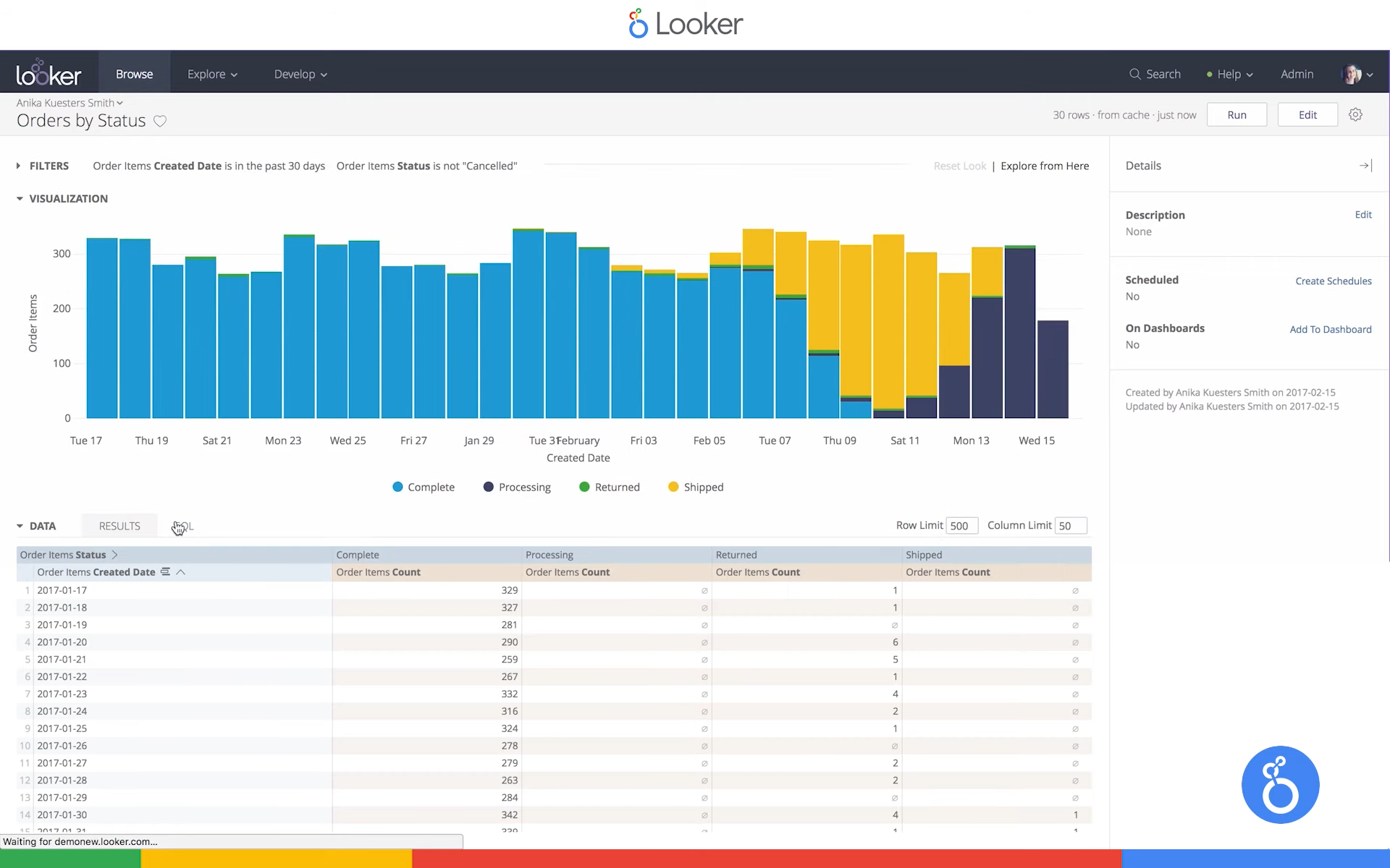
Looker is another popular BI tool with a data analytics focus, using an end-user interface for data exploration and data discovery. Made by Google, Looker integrates seamlessly with popular data warehouses like Amazon Redshift, Google BigQuery, and Snowflake. Additionally, Looker's API-driven extensibility supports easy incorporation into existing workflows.
Looker is a complete enterprise BI platform and boasts a data-modeling layer called LookML, which allows users to create custom dimensions and measures based on SQL code (though SQL is not required, it does significantly boost user capabilities). Looker has a counterpart, Looker Studio, which is a self-service BI solution for less technical users to build ad hoc reports and charts.
Looker’s learning curve is decidedly less steep than Tableau, and appears to be one of the easier business intelligence tools for non-technical users to pickup. However the flip side of this is that Looker’s data visualization tools are decidedly not as extensive as other platforms, potentially requiring additional tools to showcase your insights. Many users complain of the difficulty of including multi-media, the lack of customized data visualization and sluggish compute times.
In essence, Looker is a great tool for someone who wants optimized data modeling capabilities off a data warehouse, without the frills but also the clunkiness of a complex program like Tableau.
Price: $30 per user/month
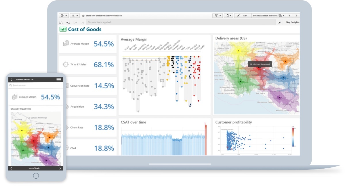
Billed as the benchmark for “third generation” analytics platform, Qlik Sense is the third most popular business intelligence software and quickly growing in popularity. Qlik Sense is designed to be the ultimate shareable dashboard, with access to insights on mobile, browser and desktop. Qlik Sense is also designed to be a tool easily used by non-technical users, not needing any coding language to use (though having functionality with SQL). It also boasts having one of the fastest learning times of any BI software with users saying you can be up and using the software in under 30 minutes.
Another popular feature of Qlik Sense are its forums which are very active and often serve to answer questions through the community. Qliksense also received very positive reviews for customer support.
The downside of Qlik Sense is that while it’s easy to pick up, users have complained about being constrained, both in trying to customize data visualization (it has a lot of pre-built drag and drop features), and data extraction methods. In other words, if you’re a small company looking for easy self-service analytics and visualization, Qlik Sense is perfect for you. If you’re a more seasoned data scientist wanting a robust tool to fit in your data pipeline, perhaps it might feel rudimentary.
Price: Custom per company
The newest entrant in the BI Sphere, Row64 is making a name for itself for blazing fast speeds combined with easy to use interface.
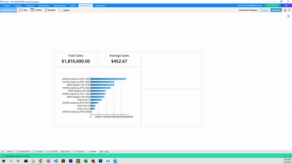
Taking cues from the popularity of Microsoft Excel, Power BI, and Tableau, Row64 leans into popular and familiar user interfaces and supercharges them to be the fastest on the market. The lightning-fast speed of Row64—both in the browser and on the desktop—make it an excellent option for those who value real-time response and low barriers to entry without compromising data capabilities or level of insight.
Beyond its speed of calculations, Row64's intuitive interface makes it the fastest on the market to build dashboards without a line of code. Combining popular drag-and-drop components with Excel-style notation, Row64 allows you to intuitively and easily build a detailed and powerful dashboard capable of displaying chart and graph views next to detailed record analysis for easy data drill-down and cross-filtering.
Row64 10x’s collaborative nature allows sharing of custom SQL and Python functions that can be leveraged by the entire data team worldwide. These “data recipes,” as they’re being called, are infinitely customizable, so any team member (including non-technical ones) can load pre-coded functions like cohort analysis to execute in their dashboard at the click of a button.
The main drawback as of now is Row64 is a current small user base means there’s less of a community to troubleshoot problems with, or a tested onboard process for larger companies. Row64 is also a new company, meaning they specialize in their strengths but lack the feature breadth of more mature products. There is also currently no mobile app, only a desktop studio version, and a web-based dashboard.
Price: Starting at $36 per user/month
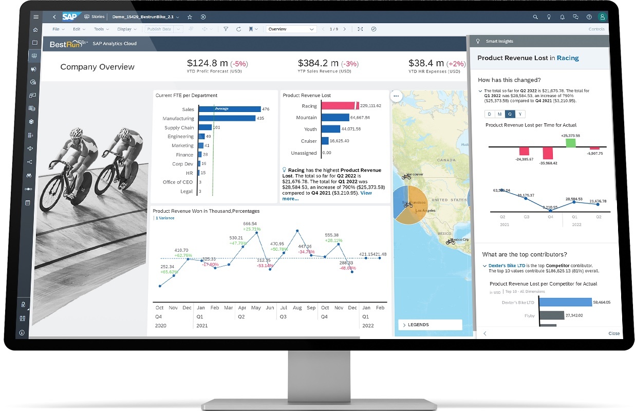
SAP Analytics Cloud is as it sounds, the cloud visualization and analytics counterpart to other software in the SAP ecosystem, specifically SAP S/4HANA. SAP Analytics receives high marks for its dashboard functionality and report creation, and its streamlined data management within the SAP HANA system. This feature is a double-edged sword as it appears that while easy-to-use data already cleaned and stored within the HANA system, it can be difficult to add new data, or blend data from different models.
Ultimately, SAP Analytics Cloud is the most enterprise-heavy applications on our list, typically being used by companies of 1,000 or more employees. The easy dashboards and report templates scale well in this model, but more advanced single users have complained that the modeling and charting are less flexible and hard to customize. SAP Analytics Cloud also lacks the community and online support that Qlik Sense excels in.
The ultimate goal of any BI software is to help you the end user make informed decisions. The manner in which data presents itself is paramount in this process.
If you’re a business or decision maker who needs to be able to manipulate data or drill down in real-time, then having a powerful analytics tool might be right for you. If you’re someone who likes to see month-to-month metrics on a templatized KPI dashboard, then perhaps a more simple, drag-and-drop interface is right for you.
Whatever decision is right for you and your company will ultimately depend on what questions you want to be answered, and by whom. Determining the answers to these ahead of time can help you ensure you pick the right software moving forward.